
Widget Test Post - All Components
This post is auto-generated for QA testing. It contains every widget variation used across the Homer CMS: content widgets (headings, lists, columns, tables, etc.) FIRST so the auto-TOC reads cleanly, then product widgets. Verify all components render correctly per the site's brand.
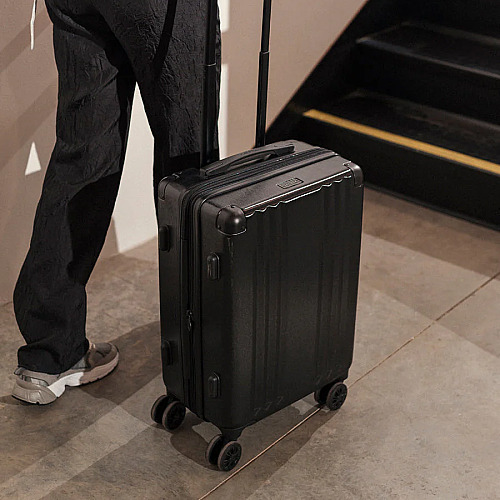
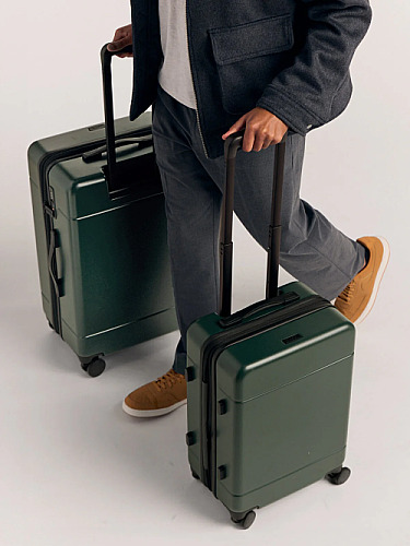
Discount code active: TEST97 on Ambeur Carry-On Luggage
Content Widget Reference
The sections below show every non-product content widget supported by the TipTap editor. Verify each renders correctly per the site's brand. Headings (H2) appear in the left-rail auto-generated table of contents.
Headings
H2 headings appear in the table of contents. H3 are sub-sections.
This is an H3 sub-heading
Use H3 inside an H2 section to break content into named sub-parts. Verify the H3 styling sits visually below the H2 in the type hierarchy.
Another H3 to confirm spacing
Two H3s back-to-back should have consistent vertical rhythm. The TOC should NOT include H3s — only H2s.
Inline Formatting
This paragraph contains every inline mark: this is bold text, this is italic text, this is underlined text, and this is strikethrough text. You can also combine marks: bold + italic or bold + underline.
Verify each mark renders distinctly and that combinations stack cleanly without breaking line height.
Inline Links
Inline links should use the brand's link color and include a hover state. Here is a sentence with an inline link to example.com in the middle, and another sentence with a longer link target at the end.
External links should be visually distinct from regular text. Verify the hover treatment (color change or underline) matches the brand spec.
Bullet List
Bulleted lists are for unordered sets of items.
- First bullet item with a short label
- Second bullet item with a slightly longer description that wraps to make sure line height is consistent across wrapped lines
- Third bullet item
- Fourth bullet item — verify the bullet marker color and spacing match the brand
Numbered List
Numbered lists are for ordered sequences and rankings.
- First step in the process
- Second step — verify the number spacing and alignment
- Third step with a longer description that wraps to a second line, confirming the number stays aligned with the first line
- Fourth and final step
Horizontal Rule
A horizontal rule separates two logical sections of content without needing a heading. The line below should match the brand's divider styling.
This paragraph appears AFTER the horizontal rule. Confirm the vertical spacing above and below the rule is balanced.
Spacer
The spacer is an editorial-controlled vertical gap. The block below is a 60px spacer; the next paragraph should sit 60px below this one.
This paragraph sits below the spacer. Confirm the gap looks intentional (not accidental whitespace).
Quote Block
The quote block is for pull-quotes inside an article.
Lorem ipsum is simply dummy text of the printing and typesetting industry. The quote block should visually pop with a left border, increased padding, and slightly larger or italicized text. Verify the brand's quote treatment.
Quote blocks can contain inline marks like bold and italic within the quoted text.
Two-Column Layout
Two-column layouts split content horizontally on desktop and stack vertically on mobile.
Left column. This column contains a short paragraph to demonstrate the left side of a two-column block. Columns are useful for side-by-side comparisons, pros/cons in narrative form, or any content that benefits from horizontal alignment.
Right column. This column should sit beside the left one on desktop. On mobile (under 768px), the columns stack vertically with a gap between them. Confirm the responsive behavior matches the brand spec.
Three-Column Layout
Three-column layouts split content into thirds — useful for product comparisons or feature highlights.
First column. Content evenly distributed across three equal-width columns.
Second column. Notice the gap between columns matches the two-column layout.
Third column. All three columns stack on mobile with consistent spacing.
Content Button
The content button is a CTA inserted inline. It uses the brand accent color and includes the mandatory product-cta class for PostHog tracking.
Verify the button: brand-correct background, pill or rounded radius per spec, hover state, and that the affiliate URL opens in a new tab if configured.
HTML Table
HTML tables are for direct data comparisons (specs, pricing, dimensions). Different from the structured Comparison Table widget which uses product data.
Sans | Dyson PH04 | |
|---|---|---|
Coverage (sq. ft.) | 1,560 | 1,730 |
CADR (CFM) | 353 | 390 |
Cost per CFM | $1.33 | $1.52 |
Filter Cost (Annual Est.) | ~$120 | ~$140 |
Electricity Cost (Annual Est.) | ~$47 (45W @ 24/7 use) | ~$54 (45W @ 24/7 use) |
Total Annual Operation Cost | ~$167 | ~$180 |
Verify: header row + label column styled with the brand's primary color, alternating row backgrounds, sticky header on long tables, and responsive behavior on mobile (horizontal scroll or stacked rows).
Product Widgets
The sections below render every product widget variation with all supported shortcode parameters. Verify discount codes appear where applicable.
1. Editor's Pick (Sidebar)
The Editor's Pick widget renders in the sidebar (desktop) and inline (mobile). It's configured via the post_product pivot with is_featured=true. The featured product for this post is Ambeur Carry-On Luggage. Check the sidebar to verify it appears correctly with the discount code.
2. Product Showcase Box (type="single")
The product-showcase-box component. Default options - no custom rating or description.
Brand
Ambeur Carry-On Luggage
Above should show image, brand, name, default stars, SHOP NOW button, and discount code.
3. Product Showcase Box (type="single" + custom rating)
Same component with rating="4" override. Uses discount-code product to verify coupon + custom rating together.
Brand
Ambeur Carry-On Luggage
Above should show 4 stars instead of the product's default rating, plus the discount code below SHOP NOW.
4. Product Showcase Box (type="single" + custom description)
Same component with a custom description override.
Brand
Ambeur Carry-On Luggage
This is a custom QA test description to verify the description parameter renders correctly in the product showcase box.
Above should show the custom description text and 5 stars.
5. Legacy Single Product Grid (id=)
The legacy format uses id= instead of ids= and renders the product-grid component.
Ambeur Carry-On Luggage
- Industry-leading ergonomic adjustability
- Premium build quality with no creaks or wobble
- Cool, breathable mesh handles long sessions
Above should show a compact product card with image, rating, and buy button.
6. Legacy Single Product Grid (featured="true")
Legacy format with featured flag enabled.
Ambeur Carry-On Luggage
- Industry-leading ergonomic adjustability
- Premium build quality with no creaks or wobble
- Cool, breathable mesh handles long sessions
Above should show the featured variant of the product card.
7. Legacy Single - No Price, No Rating
Legacy format with show_price="false" and show_rating="false".
Above should show a product card WITHOUT price and WITHOUT star rating.
8. Legacy Single - No Buy Button
Legacy format with show_buy_button="false".
Ambeur Carry-On Luggage
- Industry-leading ergonomic adjustability
- Premium build quality with no creaks or wobble
- Cool, breathable mesh handles long sessions
Above should show a product card WITHOUT the buy/shop button (and no discount code since there's no button).
9. Carousel (3 Products)
The product-carousel component with 3 products.
Above should show a carousel with 3 products. Cards should have brand, name, price, button, and discount code where applicable.
10. Carousel (4 Products)
Carousel with 4 products to test full-width layout behavior.
Above should show 4 products. Check if cards render full-width or scroll.
11. Carousel (6 Products)
Larger carousel to test scrolling/pagination behavior.
12. Carousel - No Price, No Rating
Carousel with show_price="false" and show_rating="false".
Above should show carousel cards WITHOUT price and WITHOUT star rating.
13. Carousel - No Buy Button
Carousel with show_buy_button="false".
OFF
Ambeur Carry-On Luggage
OFF
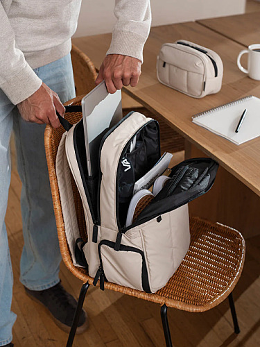
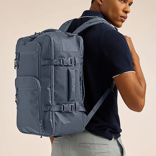
Luka 15 inch Laptop Backpack
OFF
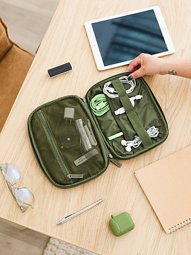
Tech Organizer
Above should show carousel cards WITHOUT the buy button (and no discount code).
14. Grid Display (3 Products)
The product-grid-display component with "Our Winner" badge on first item.
Above should show a 3-column grid. First product gets the "Our Winner" badge. Discount codes appear below "See more".
15. Grid Display (4 Products)
Grid display with 4 products to test layout with extra card.
Above should show 4 products in the grid. Check how the 4th card wraps.
16. Grid Display + Custom Ratings
Grid with per-product custom ratings via the ratings parameter.
Above should show: product 1 = 5 stars, product 2 = 4.5 stars, product 3 = 4 stars.
17. Grid Display + Anchor Links
Grid with link_mode="anchor" so "See more" scrolls to the ranked products box instead of going to external link.
Above: clicking "See more" should scroll to the ranked products box section below, not open an external link.
18. Grid Display + Mixed Links
Grid with link_mode="anchor" but external_ids overrides first product to use external link.
Above: product 1 "See more" should go to external link; products 2 and 3 should scroll to RPB.
19. Grid Display - No Price, No Rating, No Button
Grid with all display options disabled.
Ambeur Carry-On Luggage
Luka 15 inch Laptop Backpack
Tech Organizer
Above should show only product images and names - no stars, no price, no "See more" link.
20. Slider (3 Products)
The product-slider component with 3 products per slide.
Ambeur Carry-On Luggage
Luka 15 inch Laptop Backpack
Tech Organizer
Above should show a slider with divider line, price, and SHOP NOW button aligned across all cards.
21. Slider (4 Products)
Slider with 4 products to test pagination (3 per slide + 1 on second slide).
Ambeur Carry-On Luggage
Luka 15 inch Laptop Backpack
Tech Organizer
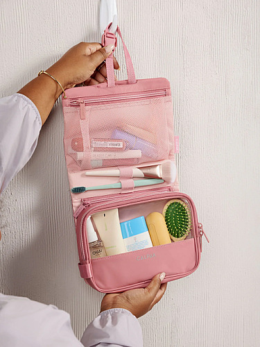
Dopp Kit
Above should show 3 products on first slide, 1 on second slide. Check pagination dots.
22. Slider (6 Products)
Slider with 6 products (2 full slides).
Ambeur Carry-On Luggage
Luka 15 inch Laptop Backpack
Tech Organizer
Dopp Kit
Hue Large Luggage
Terra 26L Laptop Duffel Backpack
Above should show 2 slides of 3 products each. Navigation dots should work.
23. Slider + Custom Features
Slider with custom pros/cons via the features parameter.
Ambeur Carry-On Luggage
Luka 15 inch Laptop Backpack
Tech Organizer
Above: product 1 should show green check pros ("Great quality", "Fast shipping"); products 2 and 3 should show red X cons.
24. Slider - No Price, No Buy Button
Slider with show_price="false" and show_buy_button="false".
Ambeur Carry-On Luggage
Luka 15 inch Laptop Backpack
Tech Organizer
Above should show slider cards with only image, name, and features - no price, no SHOP NOW button, no discount code.
25. Ranked Products Box
The ranked-products-box component with badges, pros/cons, and CTA buttons.
Top Picks
Ambeur Carry-On Luggage
- QA TEST FEATURE 1
- QA TEST FEATURE 2
Pros
Cons
Luka 15 inch Laptop Backpack
- QA TEST FEATURE 1
- QA TEST FEATURE 2
Pros
Cons
Tech Organizer
- QA TEST FEATURE 1
- QA TEST FEATURE 2
Pros
Cons
Above should render the ranked products box. Check for discount code display tight below the SHOP NOW button.
26. Comparison Table
The comparison-table component displays product attributes side by side.
|
AMBEUR CARRY-ON LUGGAGE
$196
$245
|
LUKA 15 INCH LAPTOP BACKPACK
$69
$138
|
TECH ORGANIZER
$38
$48
|
|
|---|---|---|---|
| Price | $196.00 | $69.00 | $38.40 |
| Rating |
|
|
|
| Best For | QA testing | QA testing | QA testing |
Above should render a comparison table with Price, Rating, and Best For rows.
Verification Checklist
Content widgets:
- Headings H2 and H3 render in correct visual hierarchy; auto-TOC includes only H2s
- Inline marks: bold, italic, underline, strikethrough each render distinctly; combinations stack cleanly
- Inline links use brand link color with a visible hover state
- Bullet list and numbered list render with correct markers and indentation
- Horizontal rule has balanced spacing above and below
- Spacer creates a visible vertical gap (60px) without affecting flow
- Quote block stands out (border, padding, accent treatment)
- Two-column and three-column layouts split content on desktop, stack on mobile
- Content button uses brand accent color and includes the
product-ctaclass - HTML table: header row + label column styled with brand primary; alternating row backgrounds; responsive on mobile
Product widgets:
- Editor's Pick sidebar shows discount code below pricing
- Product Showcase Box: default, custom rating, custom description all render correctly
- Legacy product grid: default, featured, and show/hide toggles all work
- Carousel: 3, 4, and 6 products render correctly; show/hide toggles work
- Grid Display: 3 and 4 products; custom ratings show correct stars; anchor links scroll to RPB
- Slider: 3, 4, and 6 products; custom features show pros/cons; pagination works
- Ranked Products Box: discount code tight below SHOP NOW
- Comparison Table: renders with correct product data
- All components use the site's accent color for the dotted border on discount codes
- Copy-to-clipboard works on all discount code buttons
- Responsive: check mobile view for all components


Picked this up last month and it's been a game changer for my home office setup. Build quality feels premium and the lumbar adjustment is finally something I can actually feel. Worth every dollar.
Solid review. I'd add that the assembly took me closer to 20 minutes (instructions could be clearer), but once it's together the chair feels rock-solid. The warranty pushed me over the edge versus the cheaper alternatives.
Anyone tried this with the headstone accessory? Curious whether the upgrade is worth the extra spend or if the base model is enough for full days of work.